popover api in lwc
Popover API in LWC: A Modern Way to Create Popovers
The Popover API is an exciting new web platform feature that brings native support for creating popup content without the need for complex JavaScript logic or third-party libraries. This API provides built-in animations, keyboard navigation, and focus management - all with just a few HTML attributes. While currently in limited browser support, it represents the future of how we'll handle tooltips, menus, and other popup content on the web.
The API shines in its simplicity - by adding popover and popovertarget attributes to your elements, you get a smooth, animated popup that follows all the best practices for accessibility and user interaction. For a deep dive into the API's capabilities, check out the MDN documentation.
The Challenge in LWC
While implementing the Popover API in Lightning Web Components (LWC) seems straightforward at first, we quickly run into a challenge. The API requires that we link our trigger element to our popover using an ID:
1<button popovertarget="my-popover">Open Popover</button>
2<div id="my-popover" popover>Popover content</div>
However, the LWC rendering engine will generate dynamically element's ID to ensure uniqueness across components. This means we can't hardcode IDs in our template, as they'll be transformed at runtime... Kind of...
For example, if we write:
1<button id="myid">Open Popover</button>
LWC will generate something like:
1<button id="myid-1234">Open Popover</button>
The Solution
Render the element that has the attribute [popovertarget] only when our component is aware of that [popover] element's dynamic ID
 1<template>
 2  <template lwc:if={popoverId}>
 3    <button
 4      popovertarget={popoverId}>
 5    </button>
 6  </template>
 7  <aside
 8    id="popover"
 9    popover="manual">
10  </aside>
11</template>
Then, on the JS side
 1import { LightningElement, api, track } from 'lwc';
 2
 3export default class myLWC extends LightningElement {
 4 @track $popover;
 5
 6 set popover(v) {
 7  this.$popover = v;
 8  if (v.id) this.renderedCallback();
 9 }
10  get popoverId() {
11    return this.$pop?.id;
12  }
13
14  renderedCallback() {
15    if(this.popoverId === undefined)
16      this.popover = this.template.querySelector('[popover]');
17  }
18}
Anchor positioning
The Popover API provides powerful positioning capabilities through the anchor attribute. This attribute determines how the popover positions itself relative to its trigger element.
The way it works is by setting the same archor name on the triggering and the target element.
1/*triggering element*/
2[popovertarget] {
3  anchor-name: --uniqueName;
4}
5/*target element*/
6[popover] {
7  position-anchor: --uniqueName;
8}
Doing that, both elements are now linked, meaning we can position the target element based on the triggering element position.
 1/*triggering element*/
 2[popovertarget] {
 3  anchor-name: --uniqueName;
 4}
 5/*target element*/
 6[popover] {
 7  position-anchor: --uniqueName;
 8  top: anchor(top);
 9  bottom: anchor(bottom);
10  right: anchor(right);
11  left: anchor(left);
12}
Now to ensure uniqueness for our anchor name in LWC we could simply reuse our popoverId property.
1get anchorName() {
2  return `anchor-name: --${this.popoverId}`;
3}
4get positionAnchor() {
5  return `position-anchor: --${this.popoverId}`;
6}
 1<template>
 2  <template lwc:if={popoverId}>
 3    <button
 4      popovertarget={popoverId}
 5      style={anchorName}>
 6    </button>
 7  </template>
 8  <aside
 9    id="popover"
10    style={positionAnchor}
11    popover="manual">
12  </aside>
13</template>
Adding animations
To animate the entering and exiting state of our popover we'll leverage the new css rule @starting-style and the property transition-behavior: allow-discrete.
You can add to the head of your community these styles:
 1[popover] {
 2  transition:
 3    display .2s allow-discrete,
 4    opacity .2s ease,
 5    scale .2s ease;
 6
 7  &:not(:popover-open) {
 8    opacity: 0;
 9    scale: 0;
10  }
11
12  &:popover-open {
13    opacity: 1;
14    scale: 1;
15  }
16
17  @starting-style {
18    &:popover-open {
19      opacity: 0;
20      scale: 0;
21    }
22  }
23}
Of course you can customize the different behaviours according to your needs or even creating custom properties to allow for more in depths customization.
Creating a Reusable Popover Component
Let's create a dedicated popover component that we can reuse across our application:
 1// c-popover/popover.js
 2import { LightningElement, api } from 'lwc';
 3
 4export default class Popover extends LightningElement {
 5  @track $popover;
 6
 7 set popover(v) {
 8  this.$popover = v;
 9  if (v.id) this.renderedCallback();
10 }
11  get popoverId() {
12    return this.$pop?.id;
13  }
14  get anchorName() {
15    return `anchor-name: --${this.popoverId}`;
16  }
17  get positionAnchor() {
18    return `position-anchor: --${this.popoverId}`;
19  }
20
21  renderedCallback() {
22    if(this.popoverId === undefined)
23      this.popover = this.template.querySelector('[popover]');
24  }
25}
 1<!-- c-popover/popover.html -->
 2<template>
 3  <template lwc:if={popoverId}>
 4    <button
 5      style={anchorName}
 6      popovertarget={popoverId}>
 7      <slot name="thumb"></slot>
 8    </button>
 9  </template>
10  <aside
11    style={positionAnchor}
12    id="popover"
13    popover="manual">
14    <slot></slot>
15  </aside>
16</template>
 1/* c-popover/popover.css */
 2button[popovertarget] {
 3  all: unset;
 4  cursor:pointer;
 5}
 6
 7[popover] {
 8  top: anchor(var(--popoverTop));
 9  bottom: anchor(var(--popoverBottom));
10  right: anchor(var(--popoverRight));
11  left: anchor(var(--popoverLeft));
12  translate: var(--popoverX) var(--popoverY);
13}
Now we can use our popover component like this:
1<c-popover>
2    <h2 slot="thumb">Popover Title</h2>
3    <p>This is the popover content that will be displayed when the button is clicked.</p>
4</c-popover>
So far the popover will show when clicking on the triggering element, but what if we want to show it on hovering it ?
I got you covered. You can add
1/* c-popover/popover.css */
2:host[data-hover] button[popovertarget]:hover + [popover] {
3  opacity: 1;
4  scale: 1;
5}
1<c-popover data-hover>
2    <h2 slot="thumb">Popover Title</h2>
3    <p>This is the popover content that will be displayed when the button is hovered.</p>
4</c-popover>
Here's a demo of how it looks like in our own application:
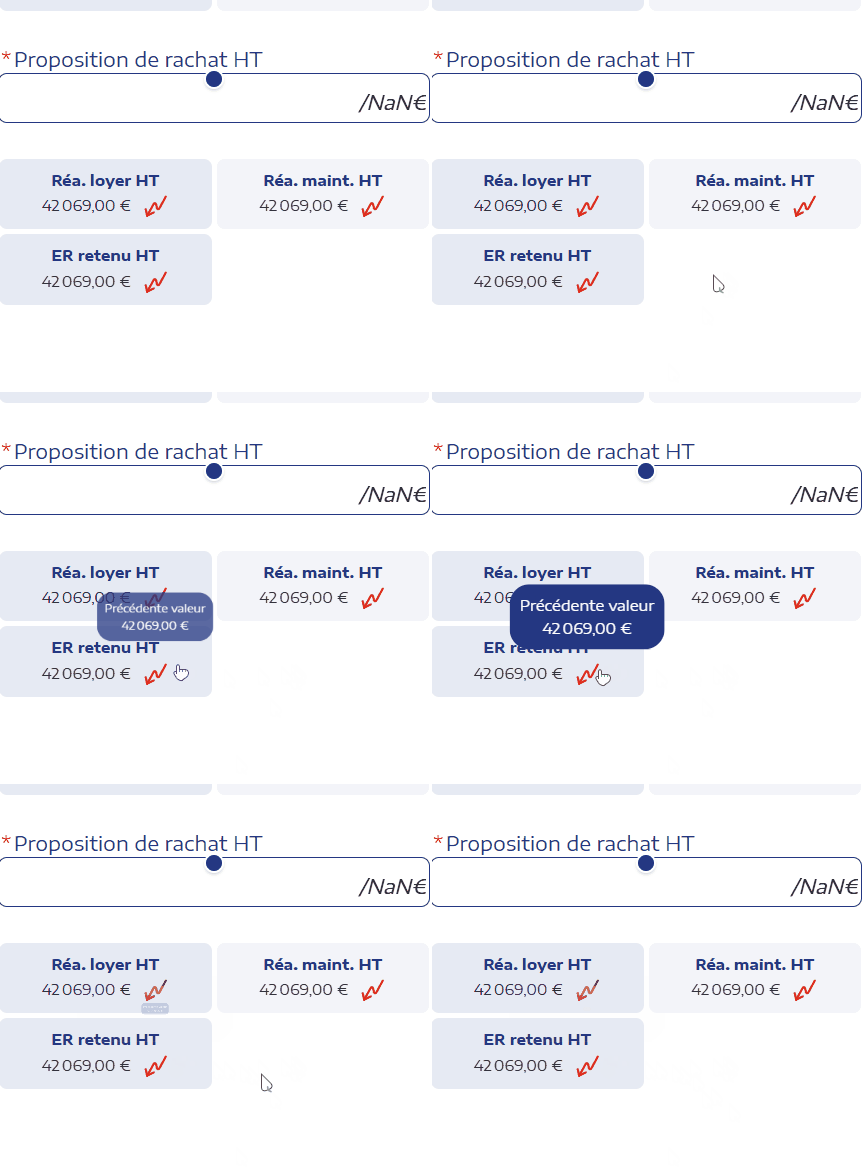
This implementation gives us a reusable popover component that:
- Handles ID generation and linking automatically
- Supports customizable positioning
- Allows for custom content through slots
- Provides basic styling that can be customized
- Takes advantage of the native Popover API animations and behavior
With this foundation, you can build more complex popovers by adding features like:
- Custom triggers (not just buttons)
- Different animation styles
- Advanced positioning options
- Close buttons
- Backdrop options
Remember to check browser compatibility and consider providing a fallback for browsers that don't yet support the Popover API. Despite limited current support, implementing the API now positions your application to take advantage of this native functionality as it becomes more widely available.